- DSI CLEAR
- Theory & Practice
- Accessibility Online
- Keyboard Navigation
- Headings, Lists & Tables
- Text Formatting & Links
- Images & Alt Text
- Shapes, Texture, & Color Contrast
- Saving Accessible PDFs from Microsoft Office
- Checking & Fixing PDFs for Accessibility
- Fillable PDF Forms
- Audio & Video Captioning
- Publisher & Third Party Content Accessibility Tips
- Content Language Accessibility
- STEM Accessibility
- Music Accessibility
- Glossary of Accessibility Terms
- Compliance Checklist
- SensusAccess
- Copyright Guide
- Online Teaching
- UNT Syllabus Template
- Teaching Consultation Request
Text Formatting & Links

People with low vision may use magnifying tools, screen readers, or a combination of both when reading web pages and documents. In order to accommodate these technologies, and meet Quality Matters standards 8.2 and 8.3, we make the following recommendations.
Contents
Accessible Text Formatting
The following is a list of formatting best practices for making text accessible, in terms of size and color:
- Size normal body text to a minimum of 12 points in size (this is the default in Canvas and Coursera).
- Enable text to be resized. Resizable text is a default feature in Canvas, Coursera, and Microsoft Office. It only becomes an issue whenever text is converted into a static image. Static images with text are most often seen in the use of graphs, charts, graphical banners, and some PDF documents.
- Use a text color for normal body text that has a contrast ratio of at least 4.5:1 with the background (you can test your colors at the WebAIM Color Contrast Checker). For detailed information on testing and adjusting color contrast, please visit the CLEAR Color Contrast page.
- Use a text color for larger headings, of 18+ points in size, that has a contrast ratio of at least a 3:1 with the background.
- Underlining should be strictly reserved for hyperlinks. Otherwise it might confuse those with visual or cognitive disabilities.
- In addition to bold, italics, and color, use word notifications to emphasize content, such as “NOTE:” or “IMPORTANT:" and similar language. This is to accommodate people who have color blindness, as well as those who have low vision.
- Consider using dyslexia-friendly font types or faces, such as Dyslexie, OpenDyslexic, Lexie Readable, or Myriad Pro.
Accessible Hyperlinks
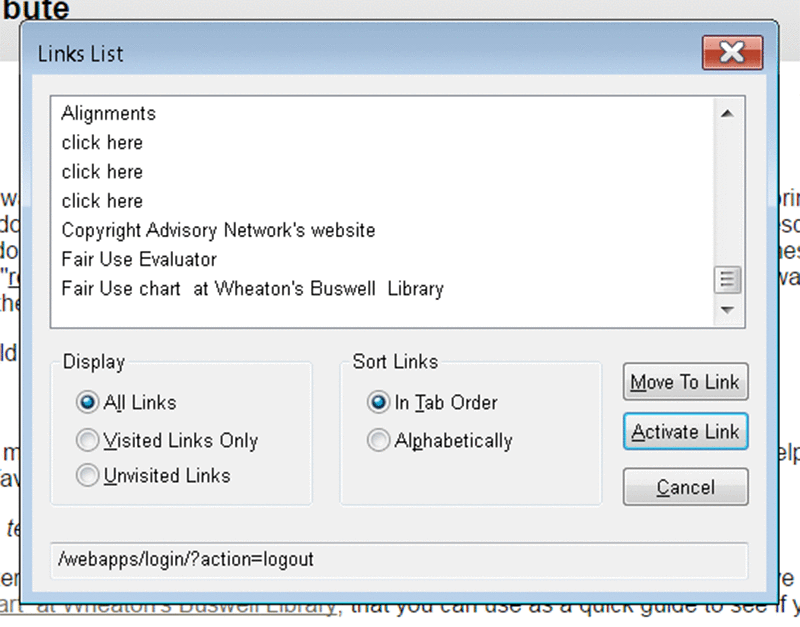
Screen reader applications, such as JAWS (pictured below and to the right), are commonly used by people with low vision. These screen readers can extract a list of links from web page content, allowing quick navigation throughout a web page via those links, which are read aloud to the user. In order to accommodate screen reader applications, and meet Quality Matters standards 8.2 and 8.3, we recommend the following best practices:
- Use meaningful (i.e., descriptive) links. An example of a meaningful link would be: the CLEAR Copyright Guide web site. The text that makes up the link provides description and context. If links are presented as full URLs or as non-descriptive text lacking context, such as "CLICK HERE," the list becomes unusable. For example, a screen reader application will voice a full URL, like https://americanhistory.si.edu/explore/stories/lincolns-words-live, as "h-t-t-p-s-slash-slash-AHmerican-history-dot-sigh-dot-eehdoo-slash-explore-slash-stories-slash-lincolns-words-live." In the case of a web page containing a dozen links, this can be highly onerous for people with visual disabilities.
- Use short phrases, or just a few words, when composing meaningful hyperlinks. Whenever possible, please avoid linking single words, entire sentences, and whole paragraphs.
- Screen readers will say the word "link" directly before a link, so it is best to omit the word "link" in your link text. Other words and phrases to avoid using in links are: "click here," "here," "more," "read more,"and "info."
- Underline hyperlinks consistently, for those who are color blind or have cognitive disabilities.
- When linking out to a format other than a web page, such as a Word document, or PDF, which will prompt the user's device to download, or a video (which may autoplay depending on the platform settings, potentially confusing the user) state the different file format within the hyperlink. E.g., A Day in Your Life on Campus: UNT (YouTube Video) or UNT Campus Parking Map (PDF).
