- DSI CLEAR
- Theory & Practice
- Accessibility Online
- Keyboard Navigation
- Headings, Lists & Tables
- Text Formatting & Links
- Images & Alt Text
- Shapes, Texture, & Color Contrast
- Saving Accessible PDFs from Microsoft Office
- Checking & Fixing PDFs for Accessibility
- Fillable PDF Forms
- Audio & Video Captioning
- Publisher & Third Party Content Accessibility Tips
- Content Language Accessibility
- STEM Accessibility
- Music Accessibility
- Glossary of Accessibility Terms
- Compliance Checklist
- SensusAccess
- Copyright Guide
- Online Teaching
- UNT Syllabus Template
- Teaching Consultation Request
Headings, Lists & Tables for Accessibility
The following page contains various tips and guidance for creating and modifying content so that it is optimally accessible. To jump to a specific section of this page, please click one of the menu items below.
Contents
Headings
While headers are useful as visual cues for skimming content, they are critical to students with low vision. These students frequently navigate page content via header lists, which are automatically generated by screen reader applications. Making text larger and bolder does not identify a line of text as a header within your content. However, identifying text as a header is usually a simple matter of using the style menus in the toolbars and menus at the top of your Canvas editor or Microsoft Office application.
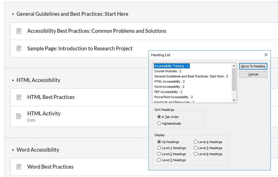
JAWS Screen Reader Heading List popup window over Canvas page content
![]() "Simulated Headers" are not useful to people who use screen reader applications. Enlarging text, using
bold or italics, or otherwise mimicking headers does not provide any useful information
to a screen reader application. Students with visual disabilities have no navigation
context without the headers being defined properly. But the good news is we will
now show you how to define headers!
"Simulated Headers" are not useful to people who use screen reader applications. Enlarging text, using
bold or italics, or otherwise mimicking headers does not provide any useful information
to a screen reader application. Students with visual disabilities have no navigation
context without the headers being defined properly. But the good news is we will
now show you how to define headers!
How to Create Accessible Headings in Canvas
In Canvas, fonts and sizes are automatically applied to headings, based on UNT's global Canvas settings. Each header has a specific size associated with it so a selection automatically sets the text appropriately. Some basic rules for headers are:
- Each page has only one Header 1 level. Canvas reserves that for the title of the page.
- Headers can be used repeatedly in a page but with no levels skipped. If a section starts with Header 2 and its related content is further divided, the next header in that section should be Header 3.
- Headers are not full sentences. Think of them as chapter or section titles - short and to the point to indicate the overall content idea that follows.
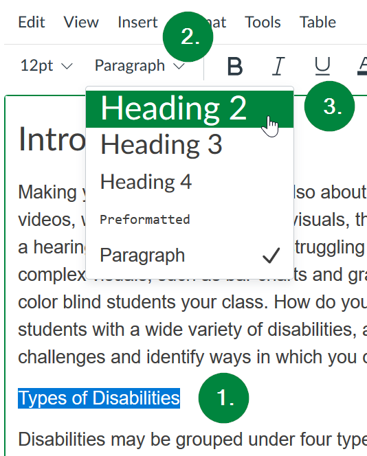
To create accessible headings in Canvas, first highlight the text you wish to transform into a heading. Second, select the styles drop-down menu at the top of the rich text editor window. And, thirdly, select the heading level you wish your text to be set at. The title of the page will automatically turn into a first level heading, so the levels you can set for text in the middle of your page range from 2 through 4. Creating a relevant hierarchy of headings will greatly help students with disabilities to comprehend and navigate your web page using assistive technology, such as screen readers.
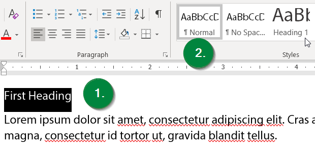
How to Create Accessible Headings in Microsoft Word
To create accessible headings, first highlight the text you wish to transform into a heading. Then, select the appropriate heading style in the home ribbon menu at the top of the window. Creating a relevant hierarchy of headings will greatly help disabled students to comprehend and navigate your web page using assistive technology, such as screen readers.
How to Create Accessible Headings in Microsoft PowerPoint
In PowerPoint, headings are not set with a style, as is the custom in Microsoft Word, per the description above. Instead, accessible headings come in the form of slide titles.
![]() Unique slide titles are needed by people with disabilities, especially those with low vision who utilize
screen reader applications. They rely upon a list of the slide titles to navigate
the presentation. If more than one slide has the same title, it creates confusion
and problems. If you have more than one slide covering the same topic, a best practice
is to add numbering to the title.
Unique slide titles are needed by people with disabilities, especially those with low vision who utilize
screen reader applications. They rely upon a list of the slide titles to navigate
the presentation. If more than one slide has the same title, it creates confusion
and problems. If you have more than one slide covering the same topic, a best practice
is to add numbering to the title.
For example, if you have three slides in your presentation on the topic of Photosynthesis, the first of these could be titled "Photosynthesis (1 of 3)." This way a person with low vision using a screen reader will always know exactly where they are.
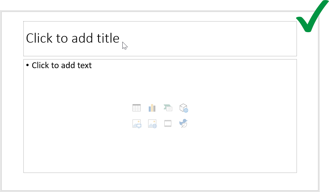
When a blank new slide is created there is a designated field for the slide title/heading. If text is typed into this field, it will automatically be set as the slide title and heading. This will be accessible without any further effort. However, there are a few common practices that impede the creation of accessible slide titles/headings. The first involves the insertion of a generic textbox and typing title text into this field instead of the predesignated placeholders for the slide title, as illustrated below.
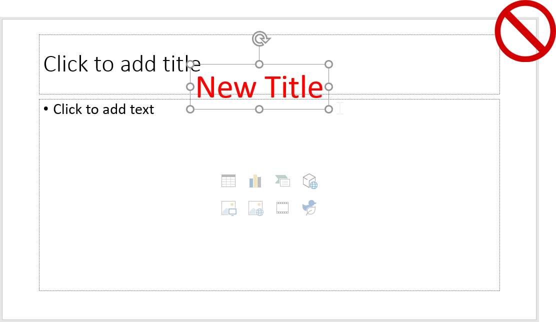
A second common practice that may cause problems with the creation of accessible headings is similar to above. However, instead of typing the slide title into a generic textbox, sometimes content will be copy-and-pasted from into the slide, over the top of the designated placeholder for the slide title, as illustrated in the screen capture below.
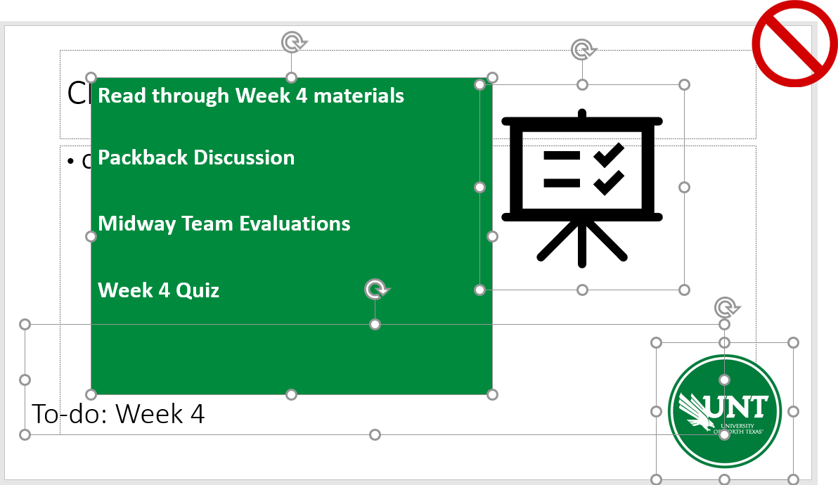
The correct way to create accessible content in PowerPoint is to use the designated spaces in each new slide and type text or insert images into them. This retains the style and order of content, allowing a screen reader to recognize them and vocalize them in proper order.
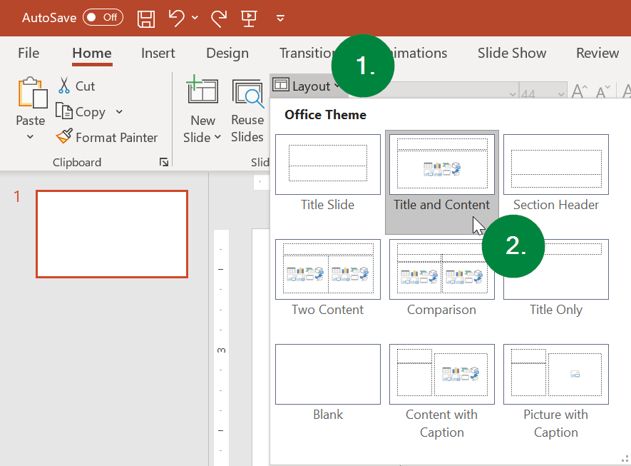
If you wish to try some variations on the default layout, we recommend utilizing the layout and slide design functionalities included in PowerPoint natively. Below is a screen capture showing the layout menu. This can be accessed by selecting (1) the Layout menu button in the Home ribbon toolbar, followed by (2) the content layout you wish to utilize from the pop-up menu.
Another useful tool to get create with your slide layout without rendering the content inaccessible or out of proper reading order is the Design Ideas pane, which can be accessed via the Design ribbon toolbar menu. The Design Ideas button is all the way to the right.

How to Create Accessible Headings/Titles in Microsoft Excel
One very common mistake is leaving column A and/or row 1 blank to give the appearance of margins. This can create issues for screen reader applications used by people with low vision. To maximize accessibility of spreadsheets, place worksheet titles in the first column (A) at the first row (1), so screen readers can find them easily.
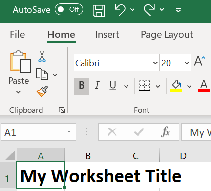
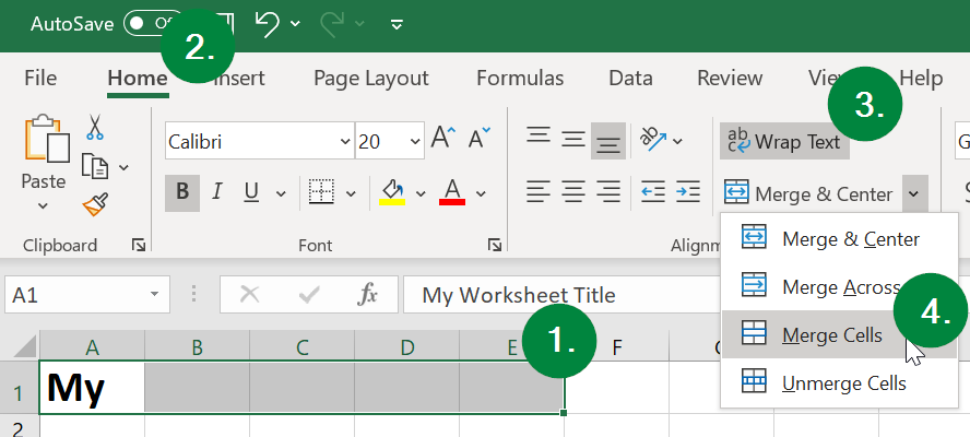
If the full text of the worksheet title does not display, you can merge cells by (1) selecting all the cells you wish to merge to make space for the title text, (2) selecting the Home ribbon menu toward the top left corner of the window, (3) selecting the down arrow just to the right of the "Merge & Center" button, and then (4) selecting the "Merge Cells" option.
Avoid merged cells for data. While it is okay to have merged cells for worksheet titles, it can cause problems with screen readers navigation if cells are merged in the data portion of the worksheet.
Avoid the use of blank rows and columns. The only exception to this rule is if you have two or more tables on the same worksheet, leave a single blank row between each table. You can resize the blank row to create a space that is visually appealing. Resize your rows and columns to provide spacing that makes the table readable (rather than using blanks to create your spacing).
Add an “End of Table” message in the row after the last row of a data in your worksheet. The text can be in white against a white background, if you wish. Thus, it will be visually invisible, but will be read by screen readers.
How to Create Accessible Headings in PDFs
In order to have properly defined headings in PDF documents, the source file (e.g., Microsoft Word DOC or PowerPoint PPT) must have their headings/titles properly styled and defined (per our suggestions above) before the PDF is saved or exported from the source. In order to check to see if your PDF has appropriate heading "tags," please follow our guide for Checking PDFs for Accessibility. If you are saving your DOC or PPT file to a PDF and it is still not accessible, then please refer to our guide on Making Accessible PDFs.
Lists
Instructions, steps to follow, a list of books or journals, a recipe, names of club members - all of these are examples of lists. Some lists are ordered (numbered) and some lists are bulleted (unordered) depending on the content. For example, a recipe for a cake may have a list of ingredients, followed by a list of steps to make the cake. The ingredients are unordered. The steps are ordered -- to be followed one after another so you end up with a cake. Courses likewise have both kinds of lists. You may have a list of materials that students are expected to use (unordered). You may have a list of assignments, readings, and discussions that students are expected to complete for a module (ordered). While visual users can see how many steps or bullet points are in a list, screen reader applications will voice the number of list items for the user so they know how long a list is before they hear each item.
Example of an Unordered List:
- Paints - oil, water color, acrylic
- Brushes - sable, blend, synthetic in several bristle shapes
- Stretched canvas - 4 sizes
Example of an Ordered List:
- Read Chapter 1
- Finish Assignment A
- Participate in Discussion 2
Simulated Lists
Simulated lists do not provide useful information to screen reader applications. Simulated lists are ones that are created manually, without the use of the editor tools in Canvas or Microsoft Office, and instead involve typing or inserting each and every bullet point, asterisk, hyphen, or number. As a best practice we recommend always using the list tools in Canvas and Microsoft Office.
Long, Multi-level List Structure
When creating multi-level lists, we recommend using a different numbering system in the secondary levels, or an unordered list in the secondary level to help screen readers differentiate between the levels of the list for the student. The first example of a best practice is the following ordered, numbered list with a secondary level unordered, bulleted list:
- Fantasy Novelists
- J.R.R. Tolkien
- C.S. Lewis
- Science Fiction Novelists
- Orson Scott Card
- Isaac Asimov
Another example of an accessible multi-leveled list is the following ordered, numbered list with a secondary level ordered, alphabetized list:
- Fantasy Directors
- Peter Jackson
- Guillermo del Toro
- Science Fiction Directors
- Stephen Spielberg
- Christopher Nolan
Another approach is to break down your longer list into smaller lists, separated by headings. An example of this would be to change the list directly above into the following:
Fantasy Directors
- Peter Jackson
- Guillermo del Toro
Science Fiction Directors
- Stephen Spielberg
- Christopher Nolan
How to Create Accessible Lists in Canvas
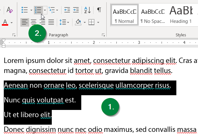
The Canvas editor allows you to create either kind of list with the list tools in the editor toolbar. The controls look very similar to ones you may have encountered in Word and PowerPoint, or similar document applications. To create accessible lists in Canvas, first highlight the sentences you wish to transform into a list. Then, secondly, select either the "Bulleted list" or "Numbered list" buttons in the toolbar:

How to Create Accessible Lists in Microsoft Office (Word, PowerPoint)
To create accessible lists in Word or PowerPoint, first highlight the sentences you wish to transform into a list. Then, select either the "Bulleted list" or "Numbered list" buttons in the toolbar:
Tables
How to Create Accessible Tables in Canvas
Sometimes tables are the best way to present information. A table for assignments and due dates, or grades and ranges can be a succinct and clear way to provide that content. Constructing accessible tables provides a unique challenge to ensure screen reader users can interpret the information. Tables need captions that give a clear indication of what the data covers. Header rows and header columns must be defined. Screen readers make use of coded header information (scoping) to index, read, and navigate table data in a logical order that associates data with appropriate header information. Canvas' table builder and accessibility checker help you include headers and scoping in your tables with just a few clicks.
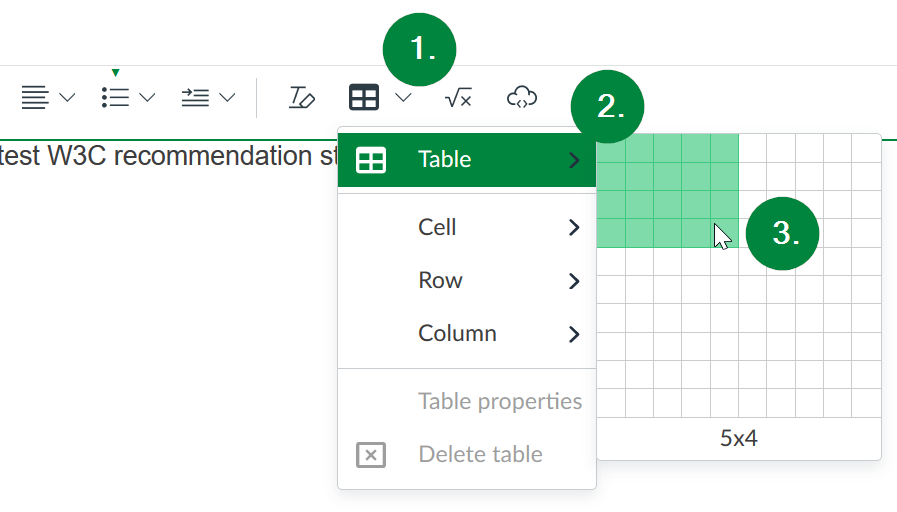
To create an optimally accessible table in Canvas, start by selecting the table creation button in the rich text editor toolbar (1). Second, select "Table" menu option (2). Then, select the number of rows and columns you would like your table to start with (3).
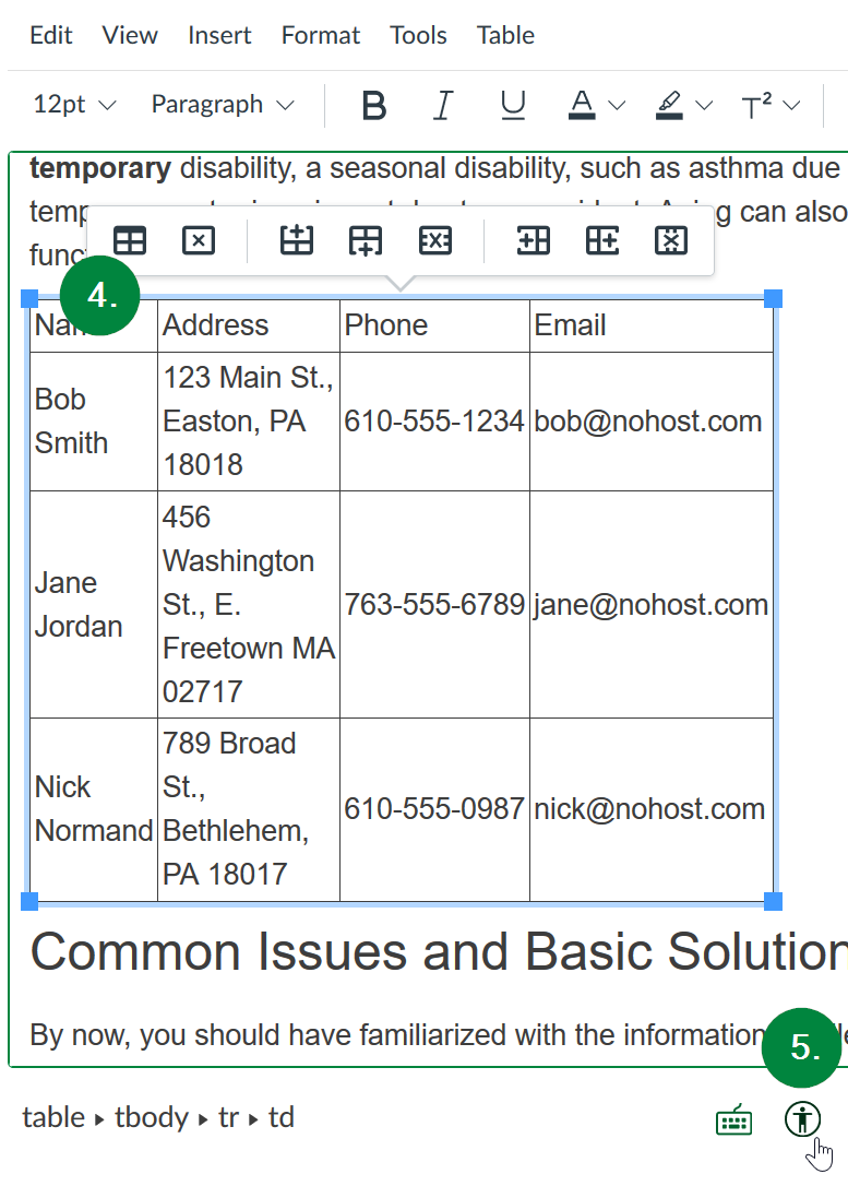
Once you have entered information into your table, select the table so that it is highlighted (4), and then click the "Check Accessibility" button below the textbox and to the right (it is a small figure of a person in a circle) (5).
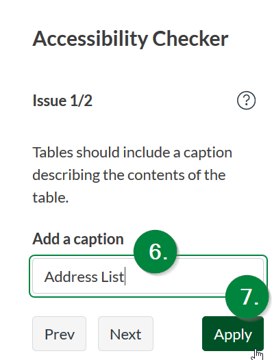
After selecting the Check Accessibility button, the Accessibility Checker pane will open on the right side of your browser window. This checker will automatically detect the lack of a caption and header rows/columns in any table in the page. You may need to select the Next button in that right pane until you encounter the option to add a table caption. Once you do, the next step of this process is to enter an appropriate caption which will display directly above your table in the page (6). Then, select the "Apply" button in the right pane (7).
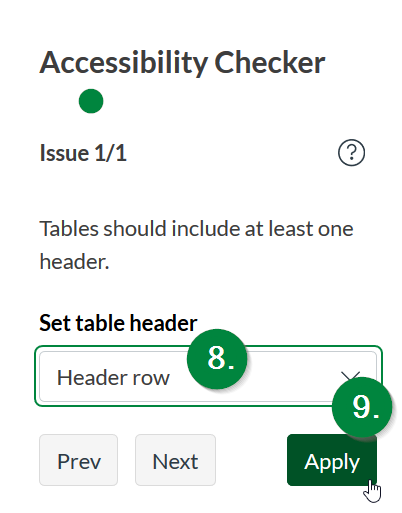
The Checker should also automatically detect any lack of header rows/columns in your table. The final step is to select whether your table has a header row (the first row in the table), a header column (the first column), or both (8). Once you select the appropriate option, click the "Apply" button once more (9).
How to Create Accessible Tables in Microsoft Office (Word, PowerPoint)
Sometimes tables are the best way to present information. A table for assignments and due dates, or grades and point ranges can be a succinct and clear way to provide that content. Constructing accessible tables provides a unique challenge to ensure screen reader users can interpret the information. Tables in Word need header columns defined and alt text to identify what data is contained therein and how that data is arranged. Table data content is located verbally for screen reader users by the header indicators. Word's table and option menus help you include headers and alt text with just a few clicks.
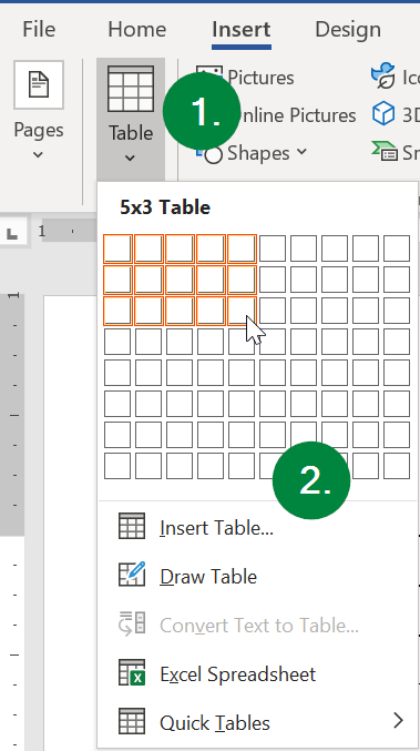
To create an optimally accessible table in Word, start by (1) selecting "Insert" from the ribbon menu at the top, and selecting the "Table" menu item. From there, (2) select the number of rows and columns you wish to insert:
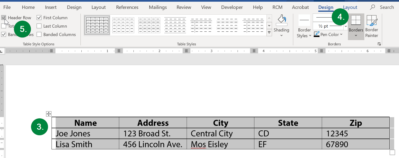
Your new table will appear in the body of your document. Select each table cell and type in your data. Reserve the top row for your column headings and style them accordingly. To make this new table accessible to people with low vision, (3) select the table in the body of your document. Then, (4) select "Design" from the ribbon menu toward the top right corner of the window, followed by (5) making sure there is a check in the checkbox labeled "Header Row" within this menu toward the top left corner of the window.
The final task, to make a Word table accessible, is to add alt text. Start by (6) right-clicking the table, and then (7) selecting the "Table Properties" item from the pop-up menu.
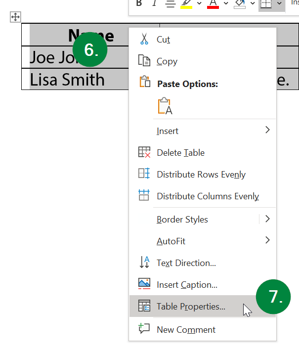
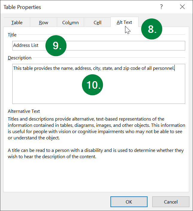
This will open the Table Properties window. From here, (8) select the "Alt Text" tab at the top, and then (9) type pertinent information for the table into the "Title" field, and (10) the description field.
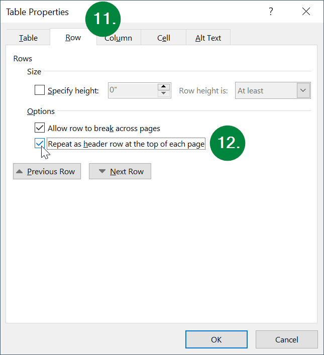
Lastly, we want to enable the header row across pages. Select (11) the Row tab at the top, and then (12) ensure the checkbox labeled "Repeat as header row at the top of each page" is checked. Finally, click the "OK" button at the bottom of the window.
Congratulations! Your table is now accessible!