Shapes, Texture & Color Contrast
With a significant portion of the world's population having varying types and degrees of color blindness, conveying ideas with color alone can create a barrier for many students. Red-green color blindness is a widely experienced form, so highlighting text with a red background, may result in text being rendered unreadable to some people. The following describes how to use graphs, color, and PowerPoint themes so they are accessible to people with low vision.
Contents

Accessible Graphs Using Shapes and Texture
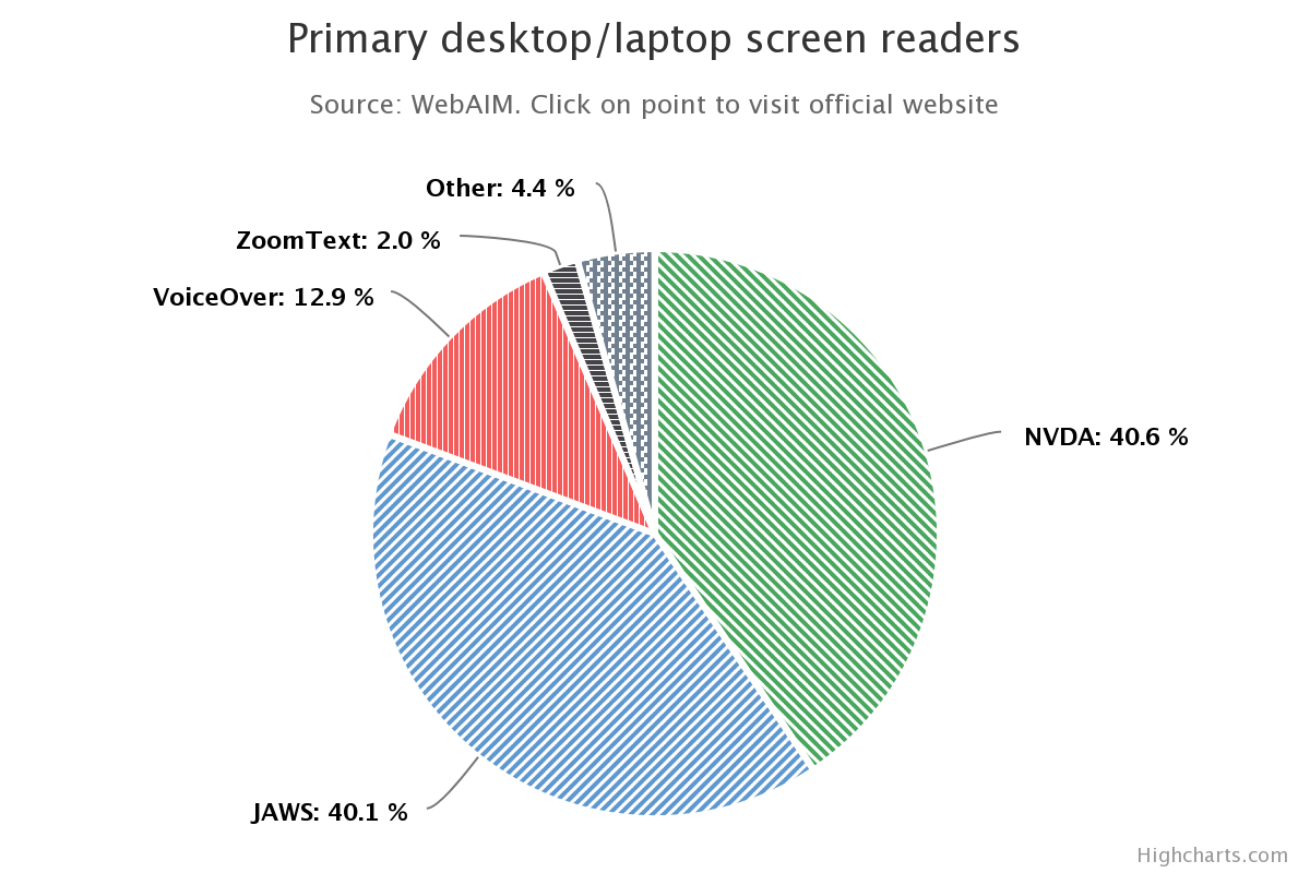
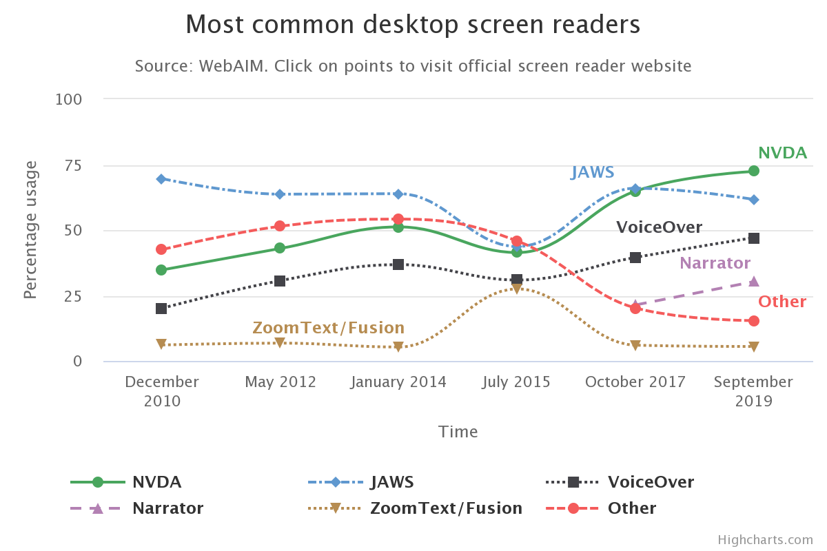
Color in graphs and charts is extremely useful, but also adding shapes, patterns, and textures ensure people with color blindness will be able to differentiate between the various items of information. Two good examples of the use of both color and texture are exhibited below.


Accessible Color Contrast
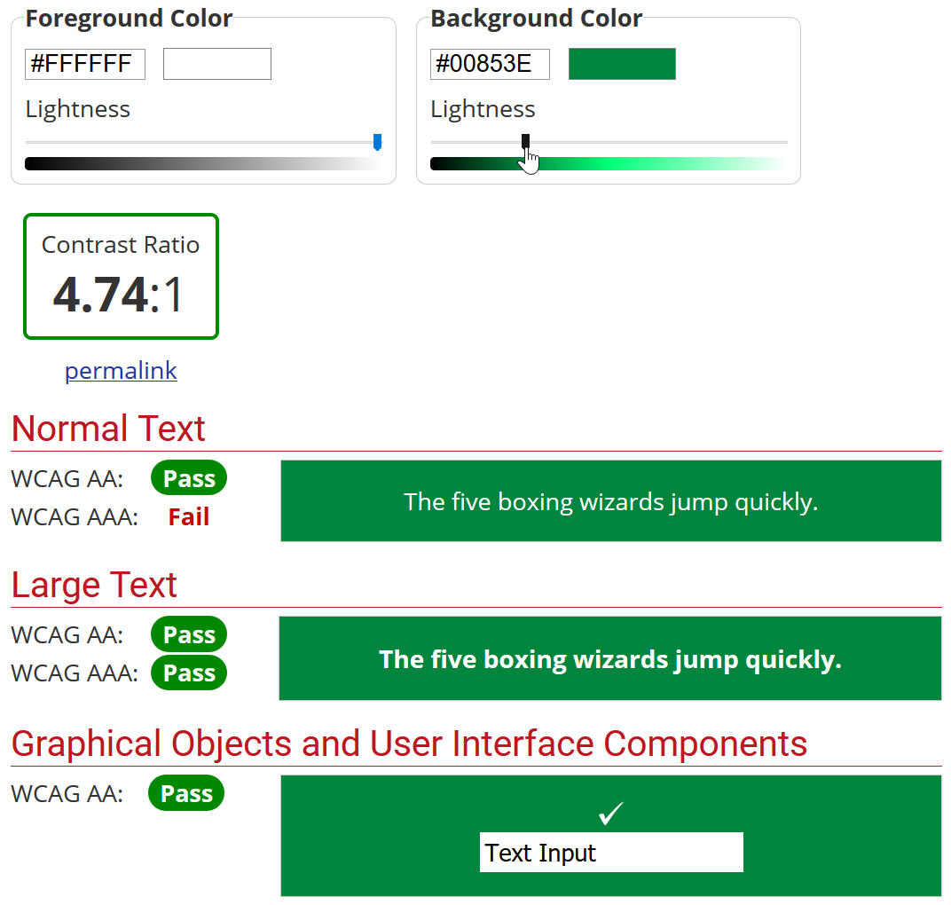
As previously discussed on the Text Formatting & Links page, web or document content with low color contrast may cause problems for people with low vision. For all material germane to learning, and required for the course, the color of foreground elements must, ideally, have a contrast ratio of 4.5:1 or better, against the background color. Though, large-scale text (18 points or larger) and images of large-scale text may have a contrast ratio of at least 3:1. We recommend using a tool like the WebAIM Color Contrast Checker, as pictured below, to assess the ratio of your content's color. If you do not know the color of your content, we recommend ColorZilla, for your web browser, or the free desktop application for Windows and macOS, Colour Contrast Analyser.

Accessible Microsoft PowerPoint Themes & Templates
As per the guidelines detailed directly above, not all Microsoft PowerPoint themes and templates have sufficient color contrast to be accessible to those with low vision. However, the following PowerPoint themes do meet the minimum standards: Gallery, Ion, Ion Boardroom, Retrospect, Wisp, Dividend, Mesh, Slate, and Damask. Also, soon UNT will have three accessible PowerPoint templates for the use of all faculty and staff, which will be available for download.