- DSI CLEAR
- Theory & Practice
- Accessibility Online
- Keyboard Navigation
- Headings, Lists & Tables
- Text Formatting & Links
- Images & Alt Text
- Shapes, Texture, & Color Contrast
- Saving Accessible PDFs from Microsoft Office
- Checking & Fixing PDFs for Accessibility
- Fillable PDF Forms
- Audio & Video Captioning
- Publisher & Third Party Content Accessibility Tips
- Content Language Accessibility
- STEM Accessibility
- Music Accessibility
- Glossary of Accessibility Terms
- Compliance Checklist
- SensusAccess
- Copyright Guide
- Online Teaching
- UNT Syllabus Template
- Teaching Consultation Request
Keyboard Navigation
People with certain disabilities -- especially those with low-vision, who utilize screen reader applications, or users with limited fine motor control in their hands, who use an adaptive keyboard -- frequently navigate web pages and files almost exclusively through the use of a keyboard. Screen readers permit a person to navigate content via keyboard shortcut lists of headings and links. Some types of files and content are more prone to problems with keyboard navigation -- most notably PowerPoint slides and PDF documents. Proper formatting of headings, lists, and tables is critical to keyboard navigation, but so is the reading order of the content elements. Below, we provide guidance on checking and correcting the navigability of your content for keyboards.

Contents
Canvas, Coursera & Microsoft Word
These applications provide content to readers in a fairly linear fashion. Meaning, by default, they present a logical reading order to people. Thus, what becomes most important is content structure. Headings, lists, and table contents must be properly identified. If you wish to apprise and correct keyboard navigability of content generated by one of these applications, please visit our CLEAR Headings, Lists, & Tables page for further guidance.
If you wish to implement a document form, please refer to the California Department of Rehabilitation's Guide to Creating Accessible Forms in Microsoft Word and Adobe PDF.
Microsoft PowerPoint
As with Microsoft Word, content structure in PowerPoint is critical to keyboard navigability. If you wish to appraise and correct keyboard navigability of content generated by PowerPoint, please start by ensuring headings, lists, and tables are properly identified and formatted. To do so, first visit our CLEAR Headings, Lists, & Tables page. Then, return here to finish by adjusting the reading order of slide contents, which we describe in detail below.
Adjusting the Reading Order of Slide Contents
A PowerPoint slideshow is navigated with the keyboard, and its content is vocalized with a screen reader, in the order in which the PPT content is defined in the slide's hidden properties, rather than how it visually appears in the slide. This defined order can be edited if you know where to look. PowerPoint has a tool called the "Selection pane" to help you check and adjust the reading order. This can help, for example, if you copy-and-paste content into the slide, or if you opt to use text boxes. Though the order of items can be affected by other factors, so you should always check and adjust the reading order of contents in your PowerPoint.
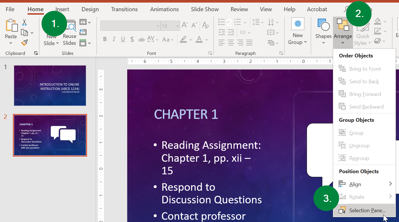
To start, make sure (1) you are on the Home ribbon toolbar, and then (2) select the Arrange button, followed by (3) the Selection pane option at the bottom of the menu.
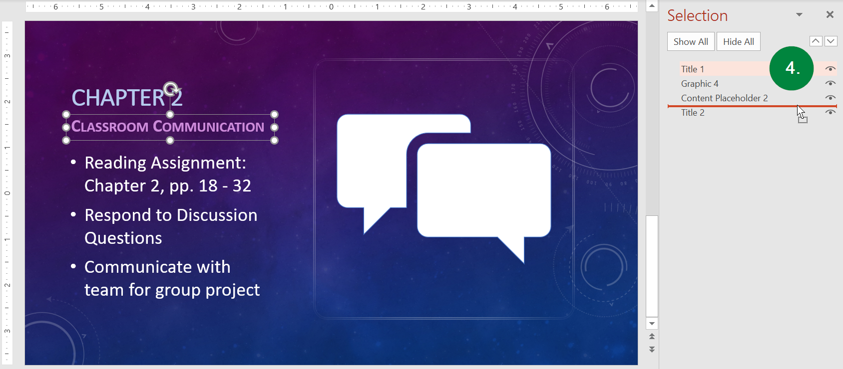
This will open the Selection pane along the right side of your window. There you
will see each of the slide's elements. Each slide should have a Title element (this
is your heading). You can reorder the items by (4) clicking-and-dragging the elements,
or by selecting the element you wish to move and utilizing the up and down arrow buttons
toward the top right of the Selection pane.
PLEASE NOTE: Ideally, the navigation/vocalization order of the elements of the slide should match
the visual order in the slide itself. However, in older versions of MS PowerPoint, keyboard navigation and a screen reader's vocalization will proceed, according to
the order of elements in the Selection pane list, from the bottom up. This is counterintuitive
since English is generally read left-to-right, top-to-bottom. In order to properly
order your content, you must ensure your "Title" element appears at the bottom of
the Selection pane list. Above that, should appear whatever content placeholders
contain your bullet points or other text. Then lastly, at the top, should be any
graphical elements.
The latest version of MS PowerPoint has the Selection Pane list matching the reading
order: from top to bottom for first to last object being read.
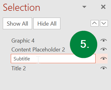
A second click, or selection, of the highlighted element will permit you to edit the
name of the element. In the example below, someone has copy-and-pasted a title element
from another slide and then used it as a subtitle. The last thing you paste into
a slide will generally appear at the top of the reading order and be read last. So,
with this element we want to move it down to second in order, so it will be read immediately
after the title. We will then select the highlighted element and rename it "Subtitle"
for clarity.
For more information, see Microsoft's documentation on How to Set the Reading Oder of Slide Contents (Links to an external site.).
Microsoft Excel
Avoid Blank Rows and Columns
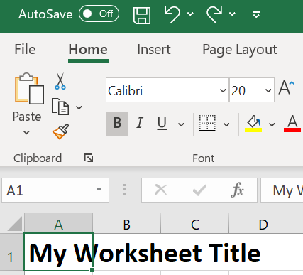
One very common mistake is leaving column A and/or row 1 blank to give the appearance of margins. This can create issues for screen reader applications used by people with low vision. To maximize accessibility of spreadsheets, place worksheet titles in the first column (A) at the first row (1), so screen readers can find them easily.
For more assistance with creating and formatting headings/titles in Microsoft Excel, please visit our Headings page.
Avoid Merged Cells for Data
While it is okay to have merged cells for worksheet titles, it can cause problems with screen readers navigation if cells are merged in the data portion of the worksheet.
Avoid the Use of Blank Rows and Columns
The only exception to this rule is if you have two or more tables on the same worksheet, leave a single blank row between each table. You can resize the blank row to create a space that is visually appealing. Resize your rows and columns to provide spacing that makes the table readable (rather than using blanks to create your spacing).
Add an “End of Table” Message
Enter the text "End of Table" in the row after the last row of a data in your worksheet. The text can be in white against a white background, if you wish. Thus, it will be visually invisible, but will be read by screen readers.
Table Cell Range and Header Cells: Define the Regions
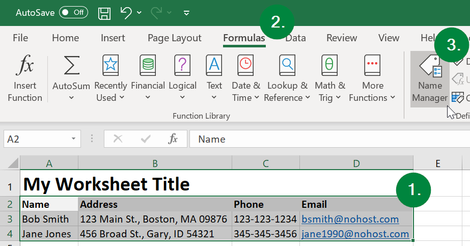
Use the "Names" feature in Microsoft Excel to name a range of cells so screen readers will voice the names of header cells along with the value of each cell. To do so, (1) select all the data cells in your worksheet or table. Do not include worksheet or table titles in your selection, but do include all row and column headers. Then, (2) select the Formulas tab in the Ribbon, and (3) choose "Name Manager" in the Defined Names group.
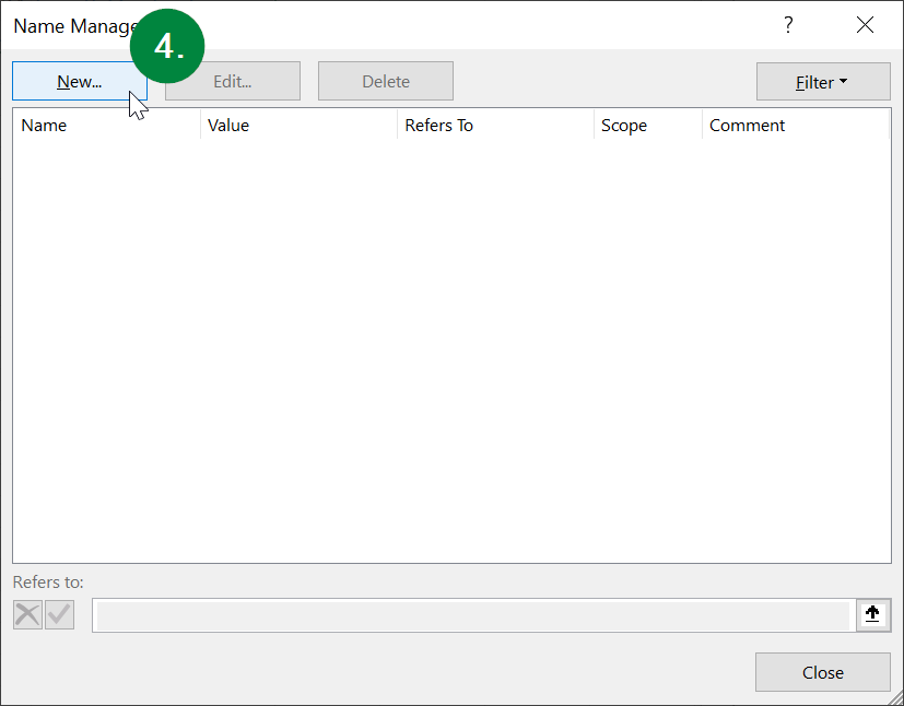
Next, (4) select "New" in the new button in the top left corner.
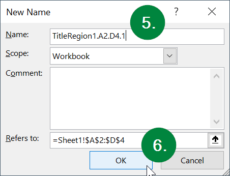
A new dialog window will open. In the "Name" field, (5) enter "TitleRegion" followed by a "1," if this is the first table on your worksheet, then a period, then the range of cells in your table from top left to bottom right (with a period in between), then another period, then the worksheet number. For example, your Title code might contain the text "TitleRegion1.A2.D4.1" while the cell locations may differ. Lastly, select the (6) "OK" button.
...followed by (7) the "Close" button.
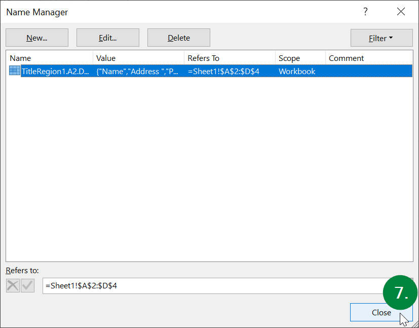
Congratulations! Your spreadsheet is now accessible for keyboard navigation!
Adobe Acrobat PDF
In order for a PDF document to be navigable via keyboard, it must contain what are called "tags." This is hidden meta data in the PDF that identifies things like headings, lists, figures (i.e., images), and parts of tables. It also defines an order of the document's content, which in turn defines the order by which a person may navigate the content via keyboard. All of the tags and properties necessary for a PDF to be fully accessible can be automatically generated at the time of the PDF's creation, if the right style, settings, and options are used in Microsoft Office, when creating the source file (e.g., DOC, PPT, etc.). To start, check your PDF for accessibility. If it not accessible, look to whether you have the original source file (e.g., DOC, PPT, etc.). If you have the source file or can acquire it, remediate the original source file's headings, lists, tables, links, and image alternate text. Then, export/save a new, accessible PDF. If you do not have the source file and cannot get it, then look to fix any known issues with the PDF.